1. The first design website, and probably my favorite is
Interior Design Magazine Online. I particularly liked this site because I found it simple to navigate through. You can go to new products and it is easy to pick items and put them onto printable pages. I felt like I could visit this site for hours because of all the different things that it contains. You can see the "best of the year" products and go to the library to view the different catalogs. I also enjoyed how often the site was updated.
2.
Tucker and Marks Design Firm online was a really neat interior design firm because it allowed me to visit their portfolio online. It was easy to go through because I would click on bedrooms and it would have a slide show. It also gave options for every room one would suspect in a home. The graphics of the site were very simple, yet affective. Red was the one contrasting color against the white, which made it easier to focus on the images of their designs.
3. Next I visited
D.A Interior Design LLC in Pennsylvania. It was particularly interesting to me not because of the images, but because it showed degrees required to get a job, and how to get a job in their design firm. The graphics looked nice yet I thought they were a little too busy. The background of the homepage had an image of one design which was distracting.
4.
David Michael Miller Associates was my next website that I viewed. It was a really neat website because it had moving text on the homepage that caught my eye. The only thing I didn't like was the bullets that allowed you to see the portfolio and other information was rather small. however, I thought the sight was easy to navigate through and the designs were really cool and contemporary. One other thing that stood out on this site were the colors. the gray on the top displayed the title, which was subtle but interesting, and then the color above each bullet made it easier to understand where to go from the homepage to the next page.
5.
Interior Reflections in Houston is another design firm. My favorite factor that this site contains is the "before and after" pictures. It allows clients to see what type of difference they do to people's homes. The set-up is also really good because they have a line of pictures followed by text underneath in blocks of color. each page on the site has a different color to make navigation easier.
6.
Innovative Spaces Inc. is a really neat site that does designs for children's spaces. You can go to the portfolio section and visit different aspects of children's design. For example, I liked how you can see only baby rooms and nurseries, or you can click and go to just children's rooms or playrooms. the white background is simple and allowed me to focus on the text and the designs. I also like how they added just a hint of color with a line of pictures near the top of every page.
7.
CEK design, inc. was my seventh website that I visited. The colors in the site and the graphics I thought were not very appealing. the red against the yellowish brown was not enough of a contrast for me to see everything the site had to offer. however, I did notice that the navigation of the site was fairly simple because the design company doesn't have many different components to hae to search through.
8.
SSDG interior design was an interesting website to visit because the homepage had a slide show going. everything else behind it was simple so that the focus could be on the images of the slide show. The slide show shows everything that they do in their design work. I also liked how they use red to explain how to navigate the website. the red bars around the pages show that you must click on those, and then they used red in the title and the bottom of the page to make it balanced.
9.
Correia Interiors and Designs LTD is a site for one designer. it shows her different portfolio pictures at the bottom of the website. This is my least favorite of all the websites I visited Because I thought it was very boring. Usually a white background makes it simple and clean, but in this case I though the white made the site bland. Also, the text was times new roman which is very typical and not unique at all.
10.
A. B Connor and Associates is a design company in Florida. There are aspects of the website I liked and disliked. I loved the black background, but I didn't like the text. It was very small, and hard to read. However, I did like that the text was white because it contrasted the black. Last, I think the website was too short and needed to contain more information and pictures.


 This is Meg's Project (one of my inspirations for the "metamorphosis" project). The purpose of the assignment is to combine two projects that others have created into three projects.
 This project is my other inspiration, which is Melia's egg project
 I tried to keep the idea of Melia's project by suspending an egg through a pole, but integrated some of Meg's project by making it look as though the egg is tangled.
 Then, I added the box around the egg, so that it started to look more like Meg's project
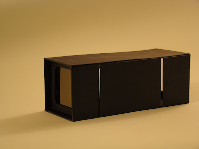
 As my final stage of metamorphosis, I changed the egg to a square like the square in Meg's project. However, I tried to keep a little bit of Melia's project in the box by making the square suspended through a pole.
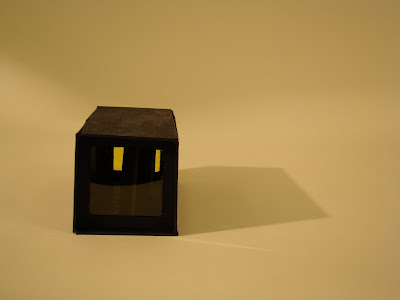
 The first picture of my final shows how I used slits in the side to show light going through the box. it explains how you can see light from some angles and not from others.
 Inside the box I put random pieces of paper to "block" the light, making it harder to find the source of the light.

